01. BUSINESS CONTEXT
The expectation was that QR would feel modern and attractive, especially for younger users. But before moving forward, we needed to understand whether customers actually understood what this feature was, how they would use it, and where it could live in the app without creating confusion.
This mattered because in Ecuador digital maturity levels are not high. Even small changes in a familiar financial interface can create friction quickly. In that environment, adding a new money movement feature was not just a visual design problem. It was a trust and information-architecture problem.
02. WHAT WE LEARNED
We relied heavily on existing research from the sibling company that powered the QR engine, since they had already studied how QR payments worked in the Ecuadorian market and the project had limited time. That gave us a head start, but we still needed to validate how this feature should appear inside Banco Pichincha’s app.
21 Users
Interviewed and tested
We ran a full round of preliminary interviews and usability testing with lo-fi prototypes
Interviews
5-Second Test
A/B Tests
Card sorting
Findings
Security concerns
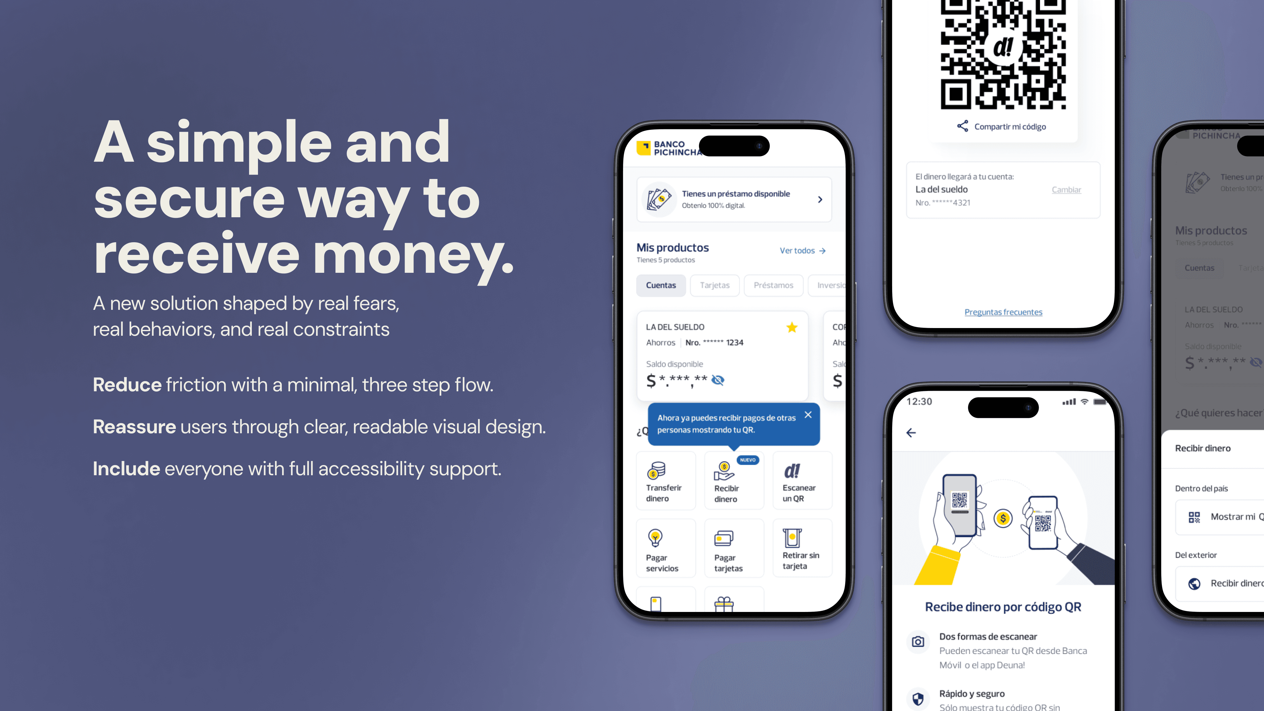
Many people did not understand QR as a safe way to move money and were afraid someone could misuse it. That meant trust had to be designed into the feature from the beginning
Language mattered
We tested different labels in Spanish, including versions closer to “request” or “ask for money,” but those created confusion and in some cases made users think the feature was related to loans or asking the bank for money. “Receive money” was the clearest and most natural option
Architecture
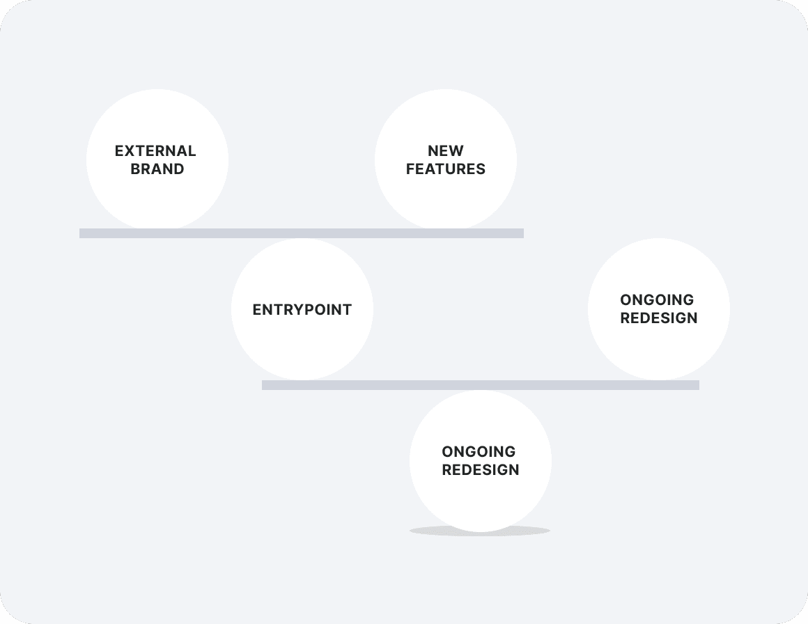
The hardest part of the problem was not the QR code itself. It was where this feature should live in the product. Our testing focused heavily on entry point position because changing the homepage of a heavily used banking app carries risk for the rest of the experience.
03. THE REAL CHALLENGE
Users needed something simple and trustworthy, not flashy.
The product needed a new entry point that did not damage established navigation patterns.
Another internal team was launching a different “receive money” feature at the same time and wanted stronger placement on the homepage.
And the QR technology came from a sibling company, whose brand had to appear inside the flow in a way that did not create suspicion.
04. KEY DECISIONS
1
Entry Point
Instead of adding more actions to the homepage, I grouped the available options under one Receive Money entry point. This let us introduce the feature without disrupting the flows people already used most.
2
Naming
We tested different labels, and Receive Money was the one people understood most naturally. Other options created confusion or suggested a different type of transaction.
3
Simplicity
Testing showed that more decorated versions created more doubt and friction. I pushed for a cleaner QR design that felt easier to understand, safer, and more reliable.
4
Branding
Because the QR technology came from a sibling company, some users questioned the extra logo. I added supporting context in the interface so the feature felt intentional and trustworthy.
05. ACCESSIBILITY
This project was not only about getting the feature out quickly. It also needed to be usable by a wide range of users in a high-stakes context. Beyond screen-reader labels, I kept the interaction intentionally simple, used strong contrast to protect QR readability, reduced unnecessary decoration, and kept the flow short so users could understand what was happening without overload.
The labels were organized into four categories:
Contextual labels: Provide users with an overview of the screen’s purpose and what they are about to do.
Event labels: Give feedback on user interactions with interactive elements, such as buttons, selectors or input fields.
Descriptive labels: Read out important screen elements like headings, descriptions or available actions.
Omission labels: ell the screen reader to skip elements that do not add value, such as decorative images, to reduce confusion.
These decisions were important because a confusing or partially accessible money transfer flow can quickly become a barrier. Ensuring clarity for all users, regardless of familiarity with technology or visual ability, was a core priority.

06. OUTCOME
I left the bank before I could track post-launch performance, so I would not invent product metrics here. But the feature shipped, it is still live, and the core structural decision behind it, the “Receive Money” bottom-sheet entry point, was strong enough to influence later features as well. That matters because it shows the work was not just visually approved, it was durable inside the product.
07. WHY THIS CASE MATTERS
I can take a loosely defined business idea, find the real product problem underneath it, test the parts that matter most, and shape a solution that respects both user trust and product architecture. In this case, the most important design work was not drawing the QR screen. It was defining where the feature belonged, what it should be called, and how simple it needed to be for people to use it confidently.


